LOGO DESIGNS
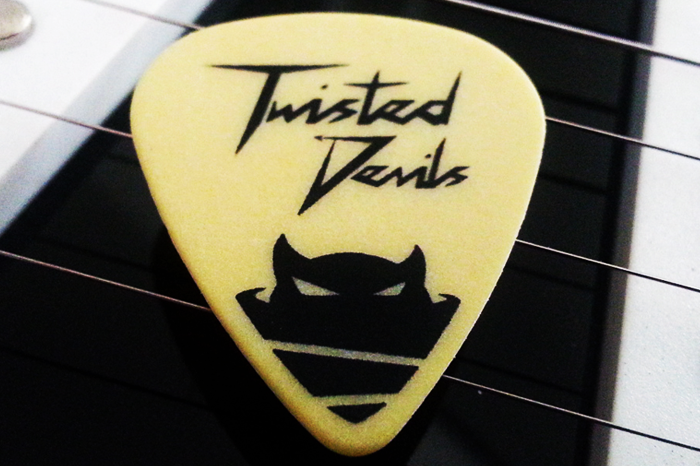

TWISTED DEVILS GUITARS
Branding Package
Branding Package
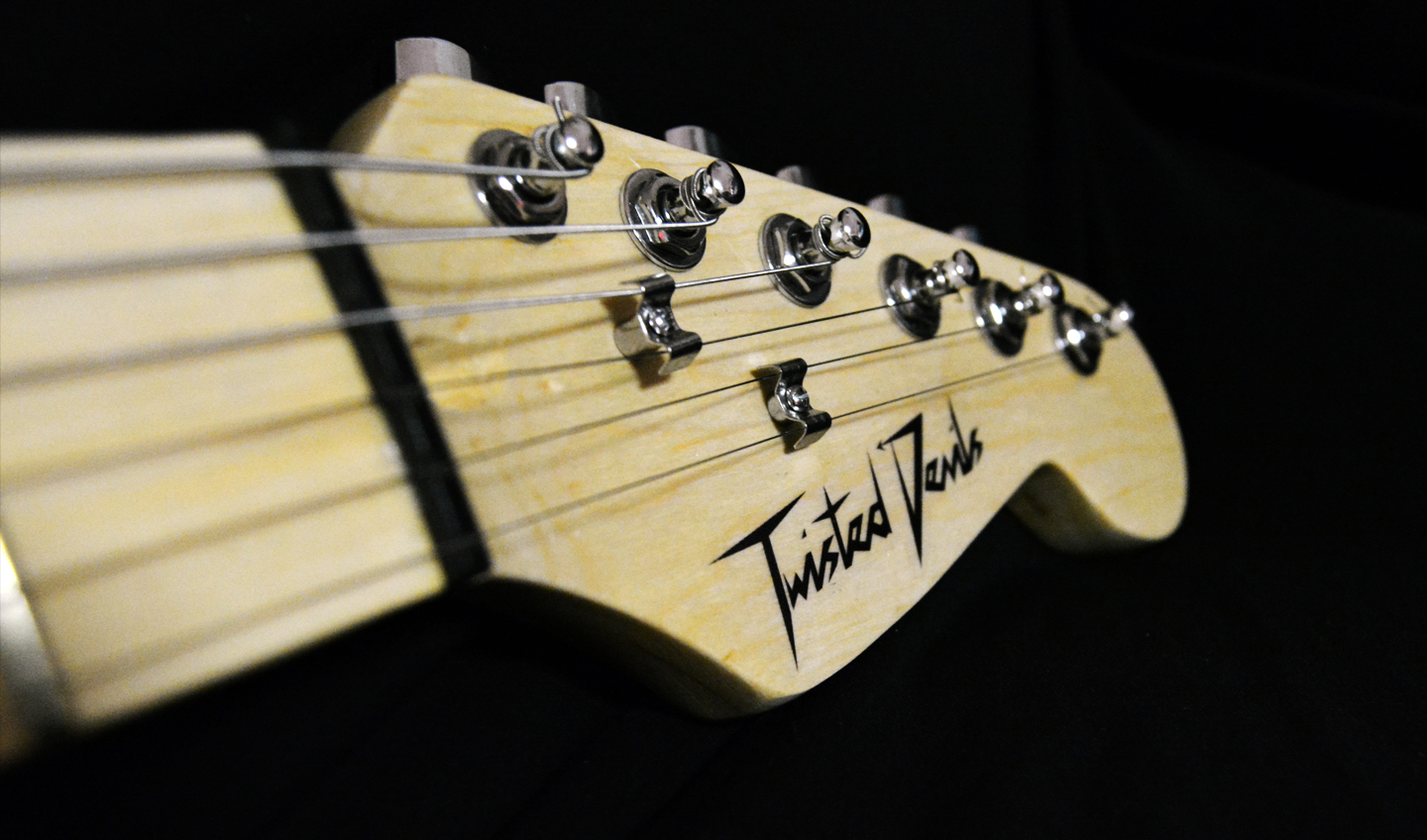
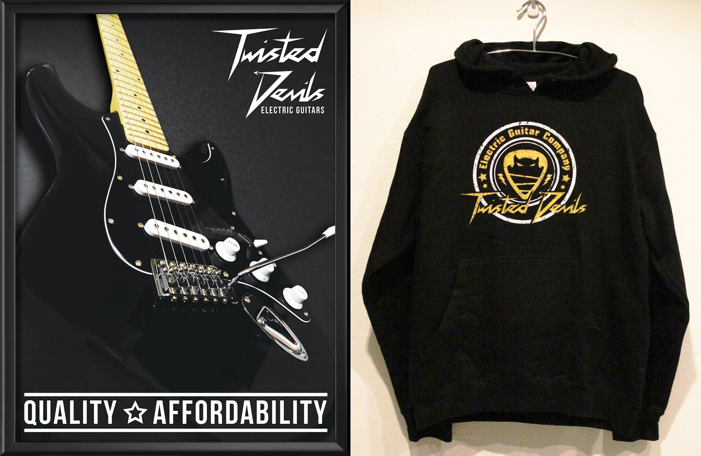
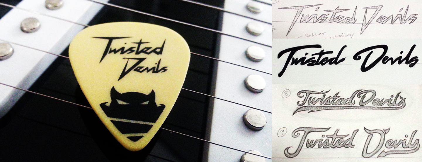
Senior branding and promotional design package project. This project consists of the design of the logo and promotional materials such as the poster, hoodie design and the guitar pick design. Response during the reveal exhibition of the designs was positive. All of the free guitar picks to promote the brand at the event were taken and the audience complimented the look of the devilish character in the logo. 
RJ BAR AND GRILL
Branding Package
Branding Package
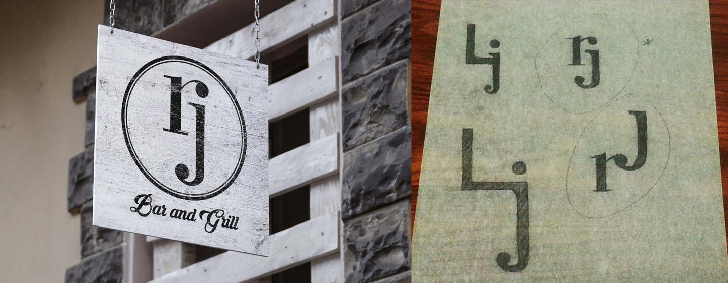
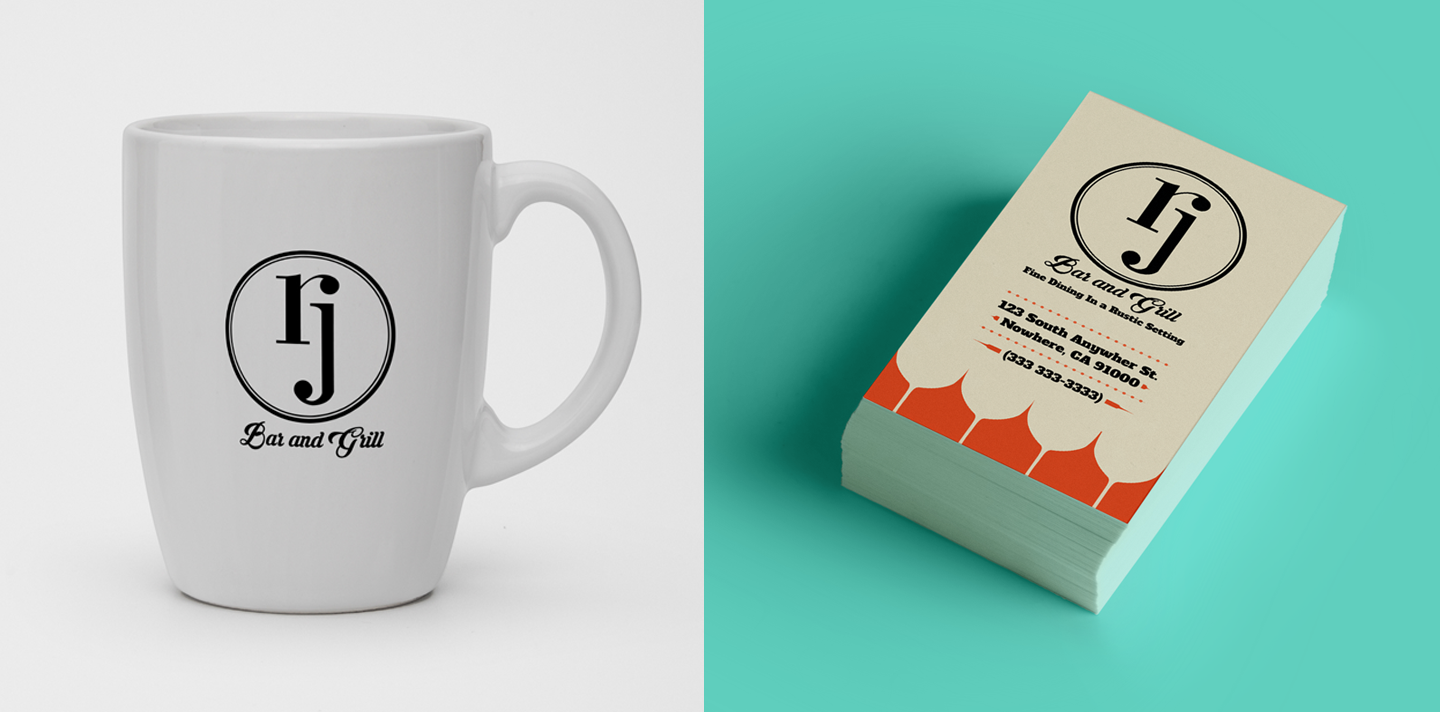
Hand made letter-form was drawn for the letters R and J and arranged to create an interesting logo concept. The logo appears very balance and the simple look of the logo allows it to be applied to other parts of the restaurant business such as business cards and also mugs.
IRISH SPRING
Logo and Package Redesign
Logo and Package Redesign
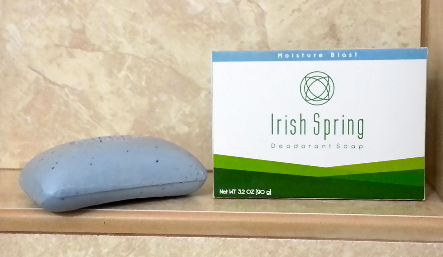
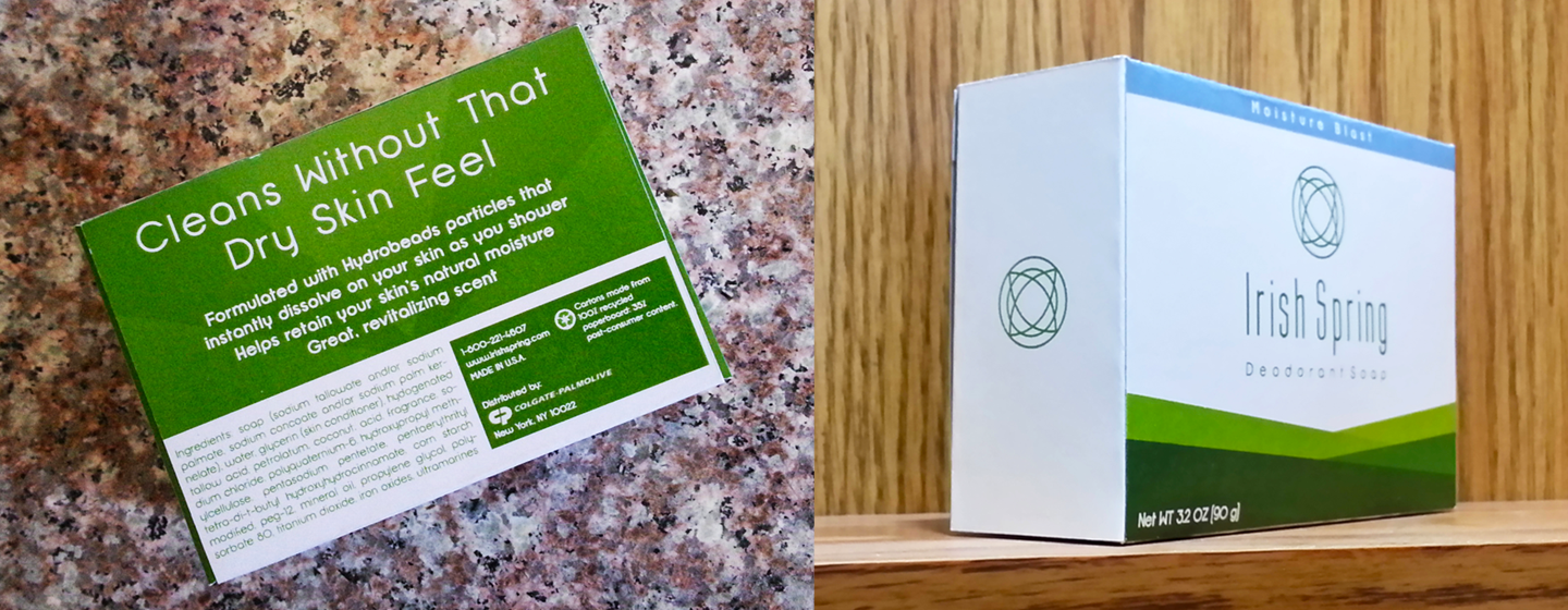
Hypothetical packaging redesign. The goal of the project is to pick a package design for an existing brand and redesign it taking the brand message in a different direction. This shows flexibility as a designer by being able to reinvent the image of an existing brand. Irish Spring original package design appears playful so this redesign of the packaging appears more elegant and refined.
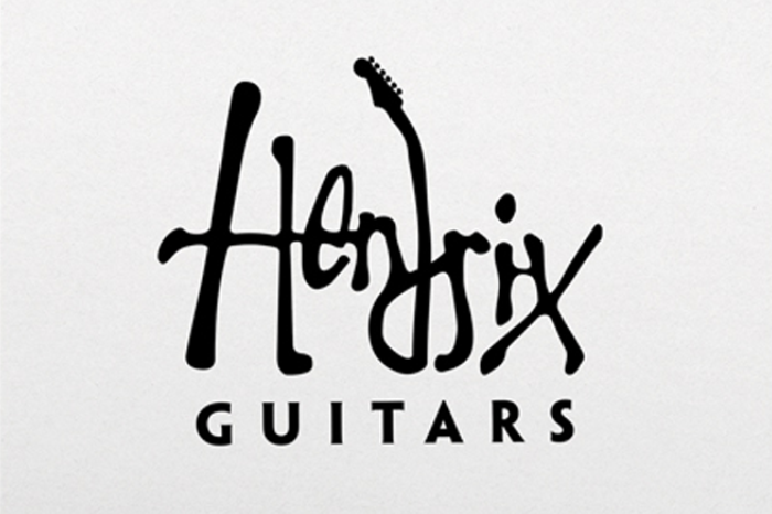
HENDRIX GUITARS
Logo Design
Logo Design
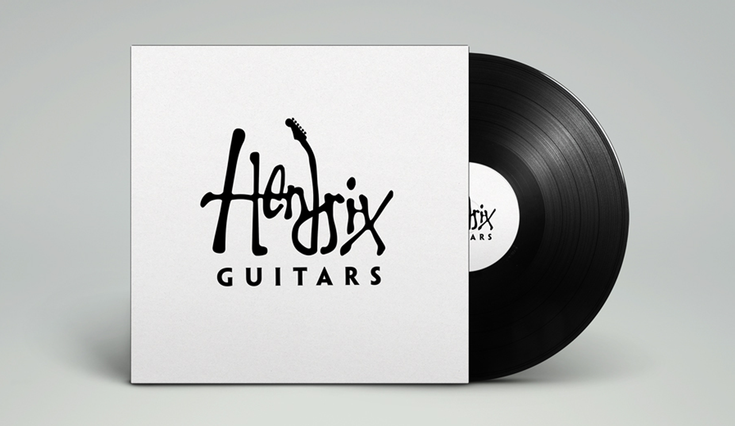
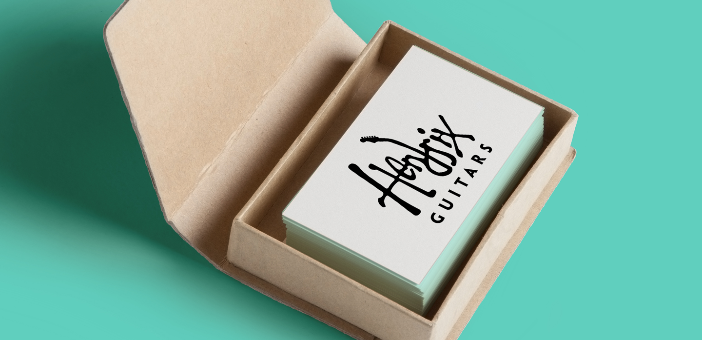
Logo design for a fictional guitar company known as Hendrix Guitars. Hendrix Guitars makes hand made guitars which means each guitar has a personal touch. A stylize version of Jimi Hendrix own signature is used for logo to give it that same personal touch. The clean yet interesting approach to the logo keeps it timeless.
PRINT AND DIGITAL DESIGNS
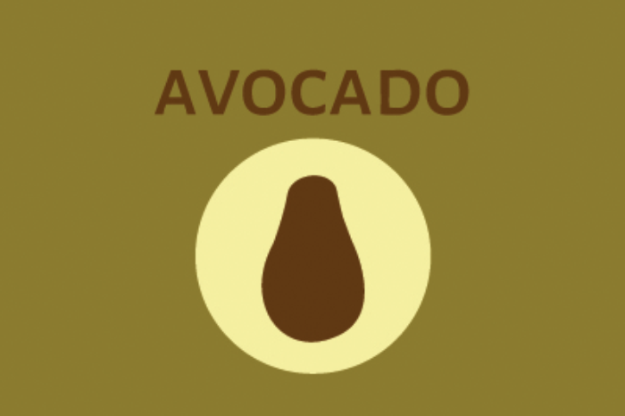
HOW TO GROW AN AVOCADO
Infographic Poster Design
Infographic Poster Design
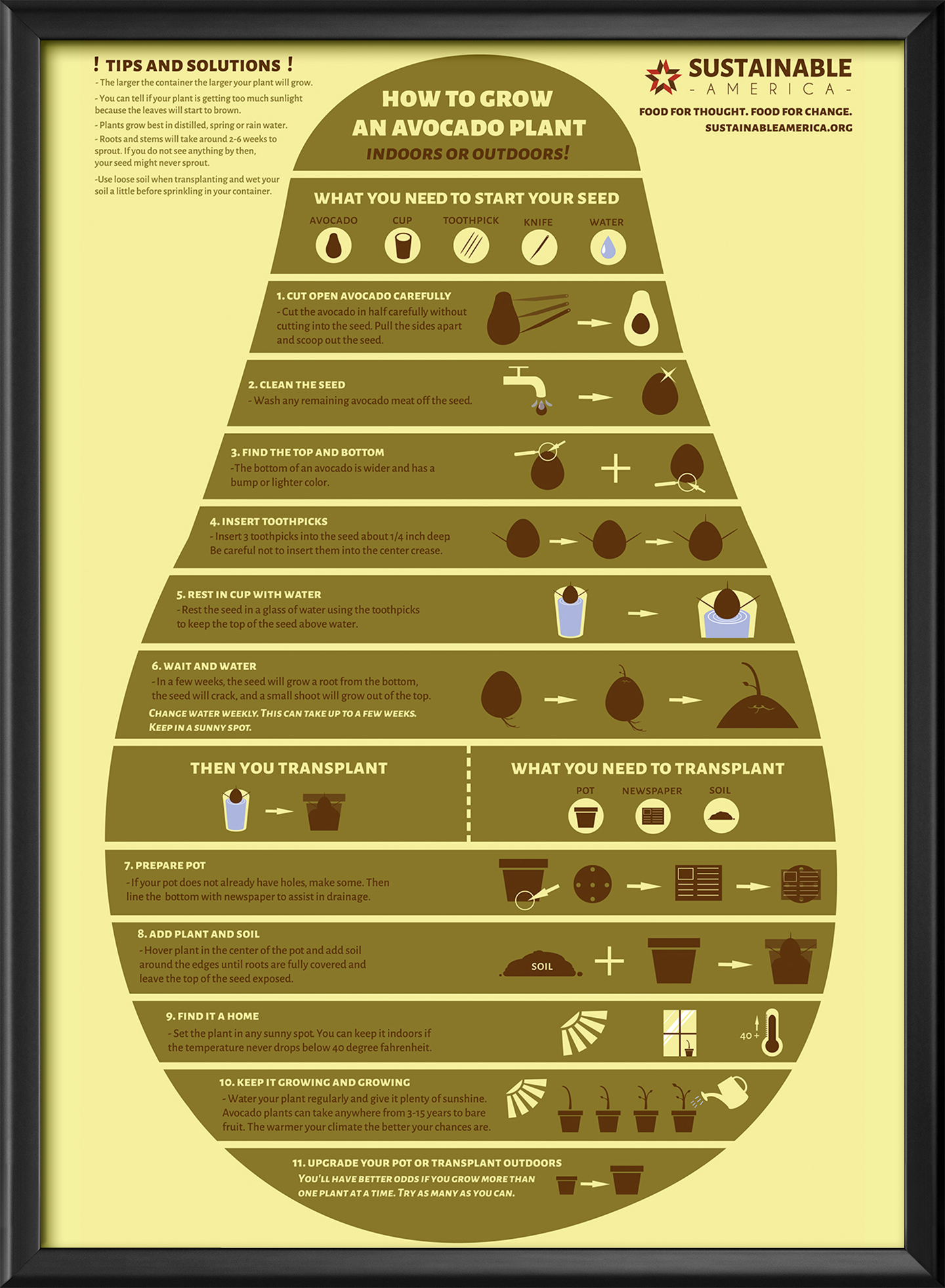
How to Grow Avocados is a student infographic poster design that presents the steps by Sustainable America on growing avocados. The earthy color tones work well with the overall theme of growth and sustainable living which is the goal of the campaign and the poster.
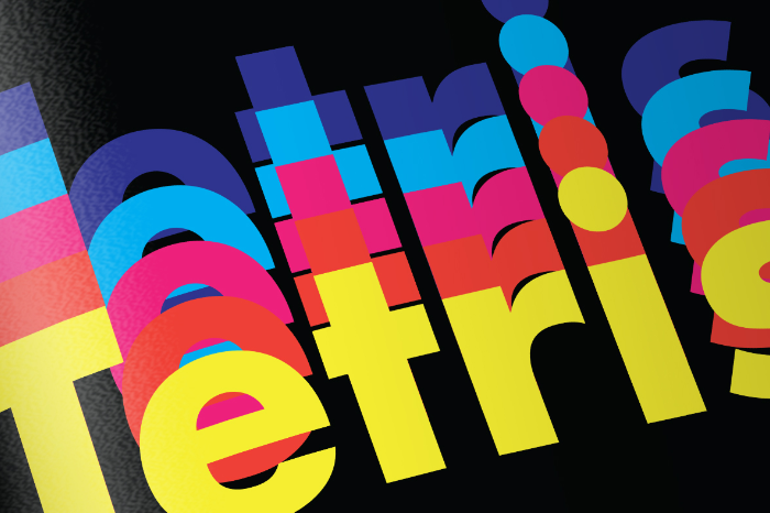
PRESS START
Booklet Design
Booklet Design
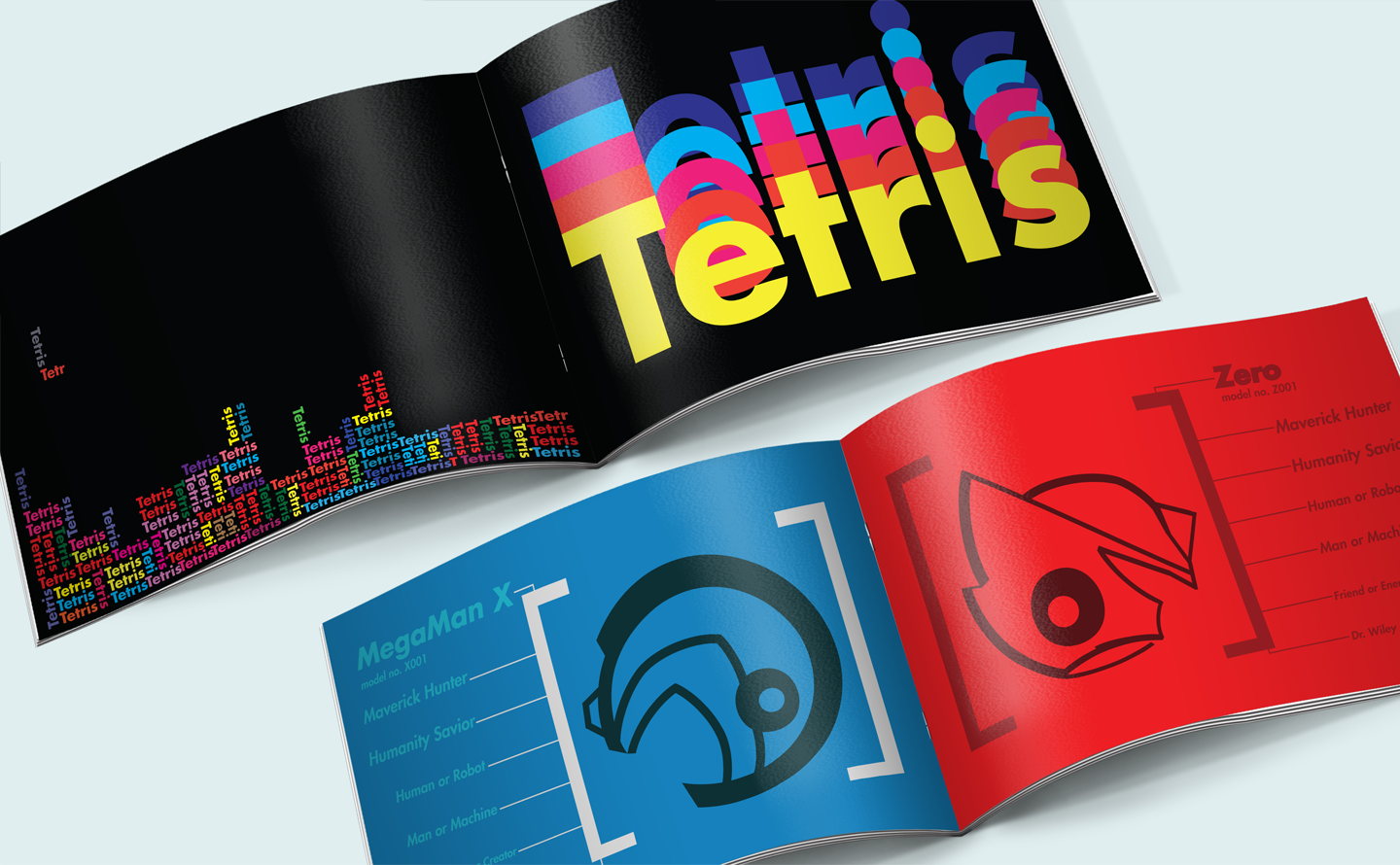
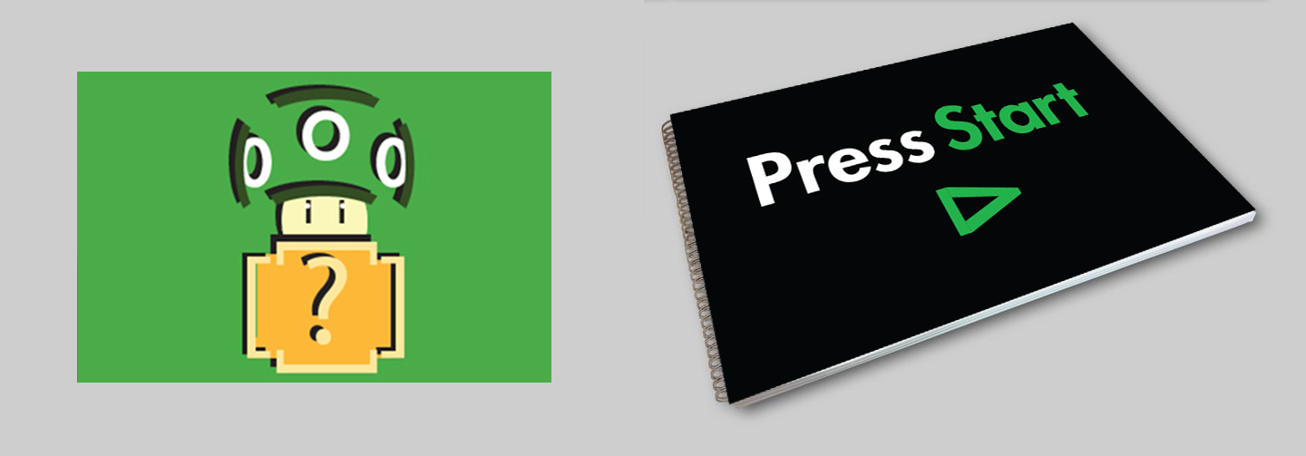
Press Start is a typographic booklet that explores the use of layout, type and color based on the theme of video games. When the booklet was presented to other graphic designer for evaluation, it was well received. The layout and vibrant colors of the font on the Tetris page is one of the highlights of the booklet. A sense of movement is achieved by using different colors of the word Tetris and placing them behind each other mimicing motion blur of the falling blocks.
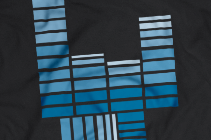
ROCK 'N' ROLL & ELECTRIC 80'S
Graphic Shirt Design
Graphic Shirt Design
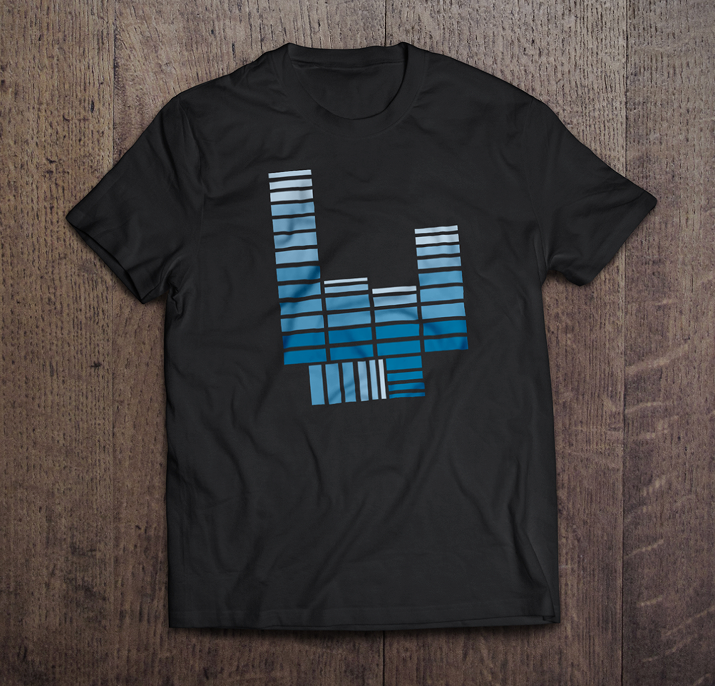
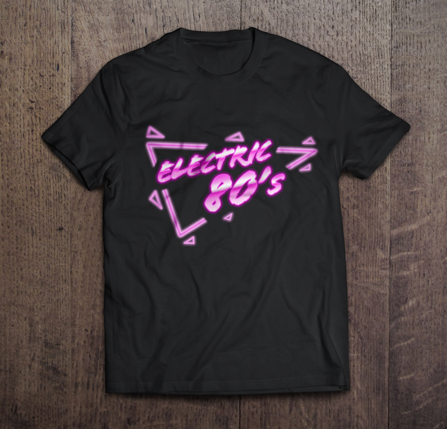
Music inspired graphic t-shirt design concept for a t-shirt design contest. The rock 'n' roll hand gesture is combined with the equalizer bars found on music equipment to create a design that celebrates both rock and music. In the second design a glowing neon effect is applied to represent the electric music of the 80's.
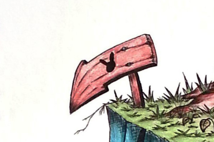
THE RABBIT HOLE, IMAGINATION, A HALLOW NIGHT, TO MARS
Traditional & Vector Illustrations
Traditional & Vector Illustrations
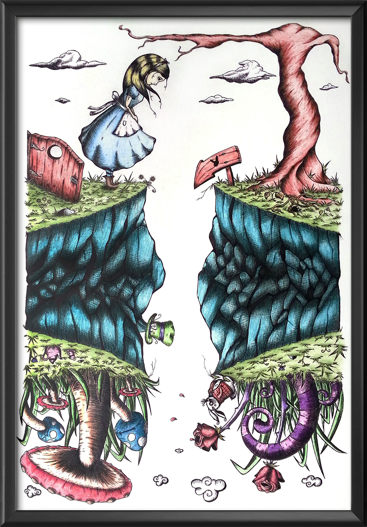
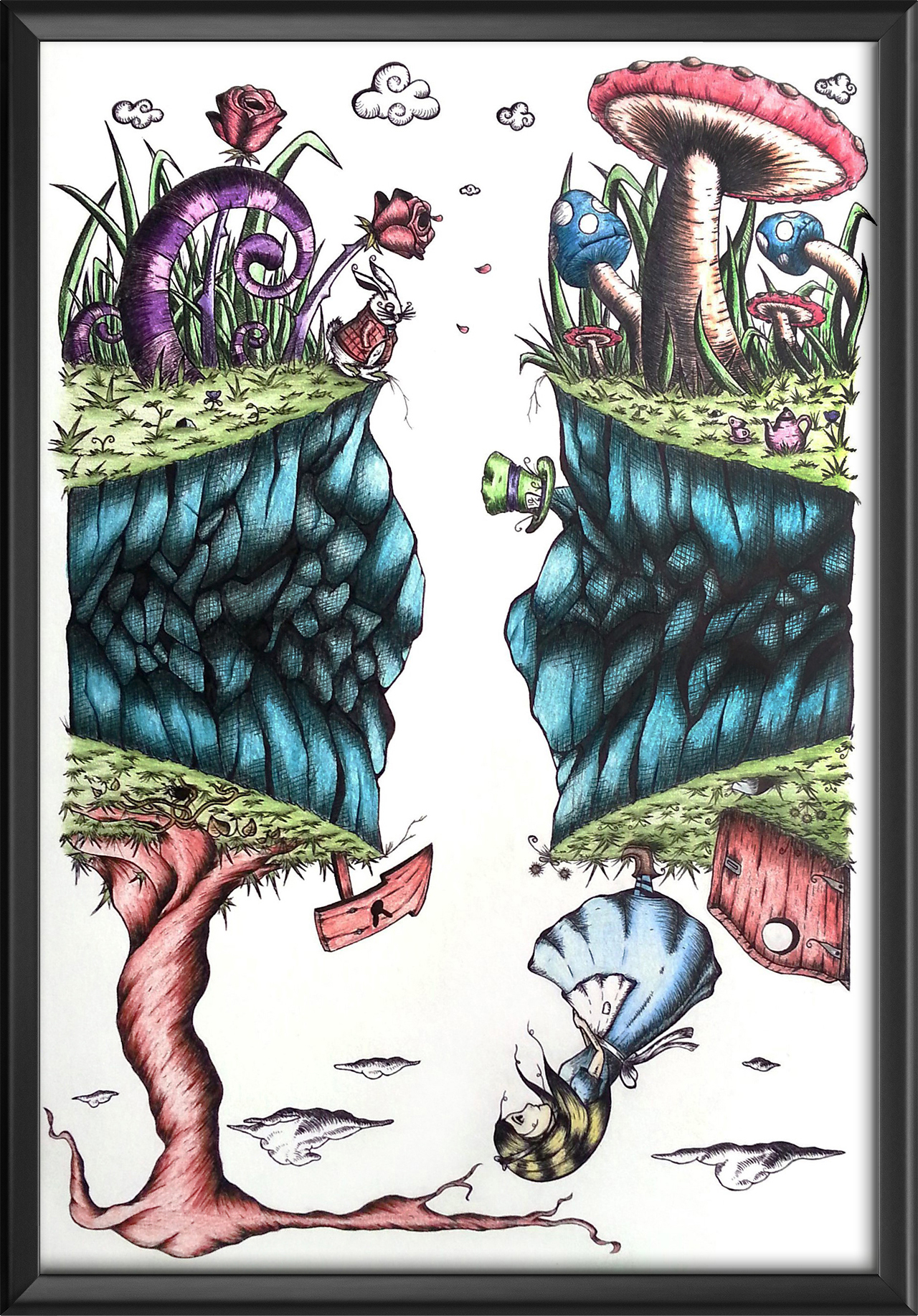
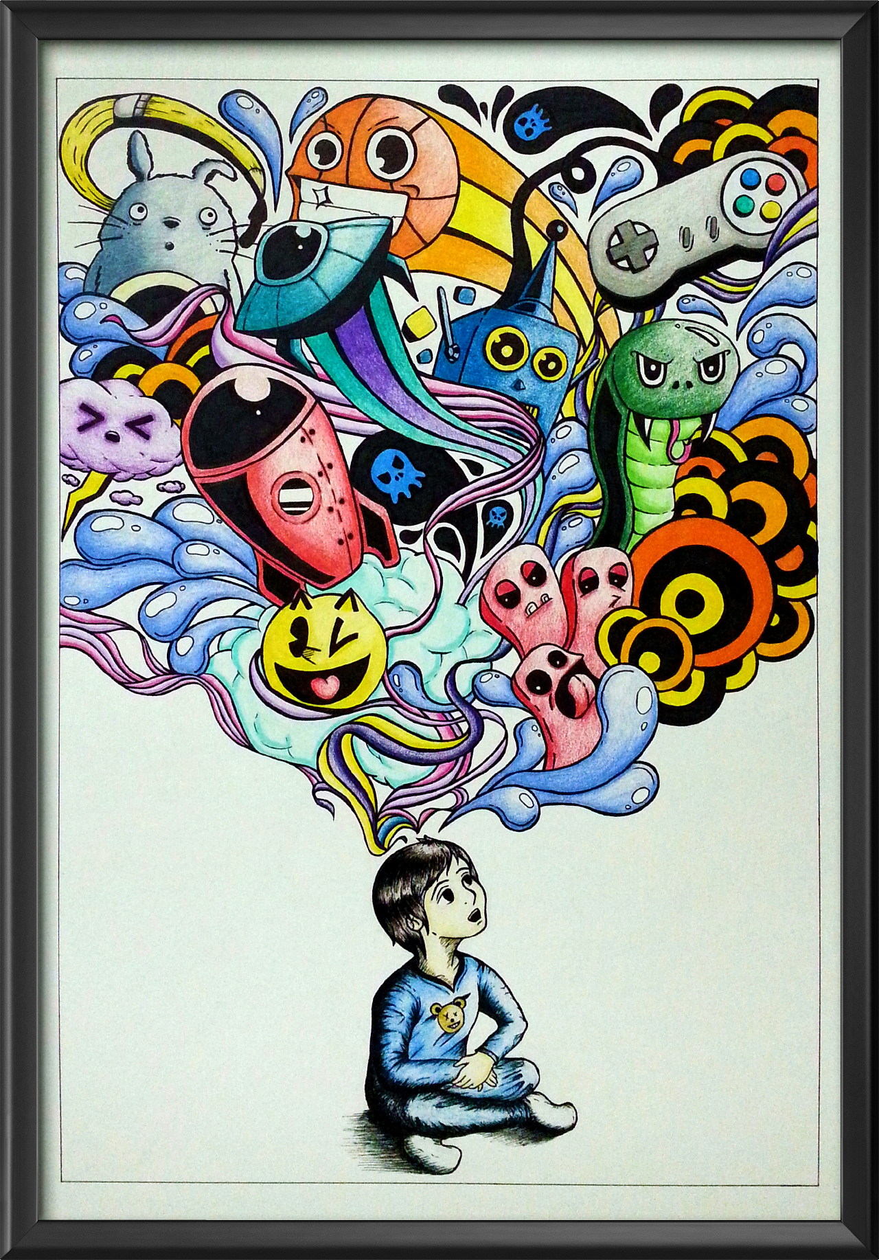
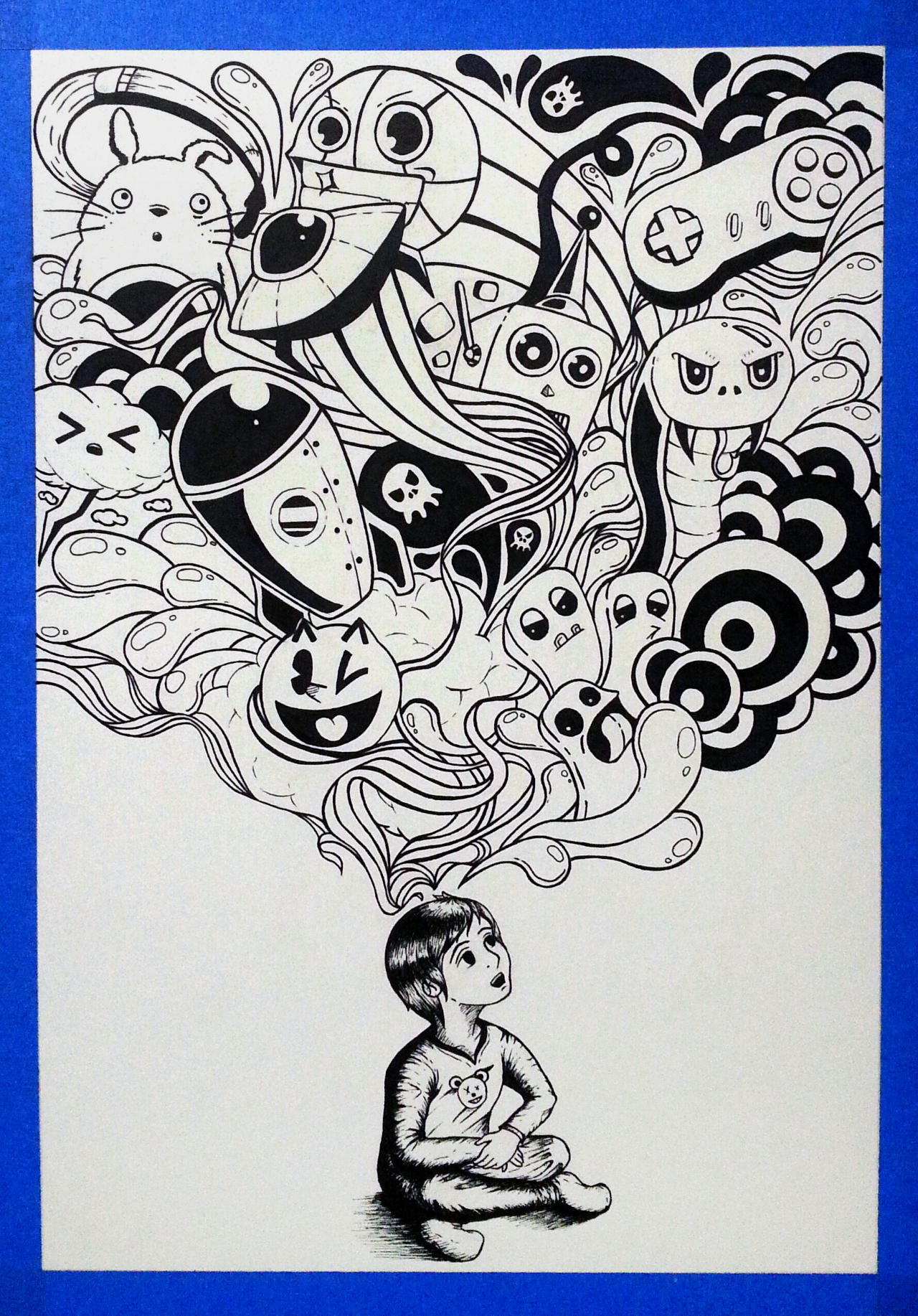

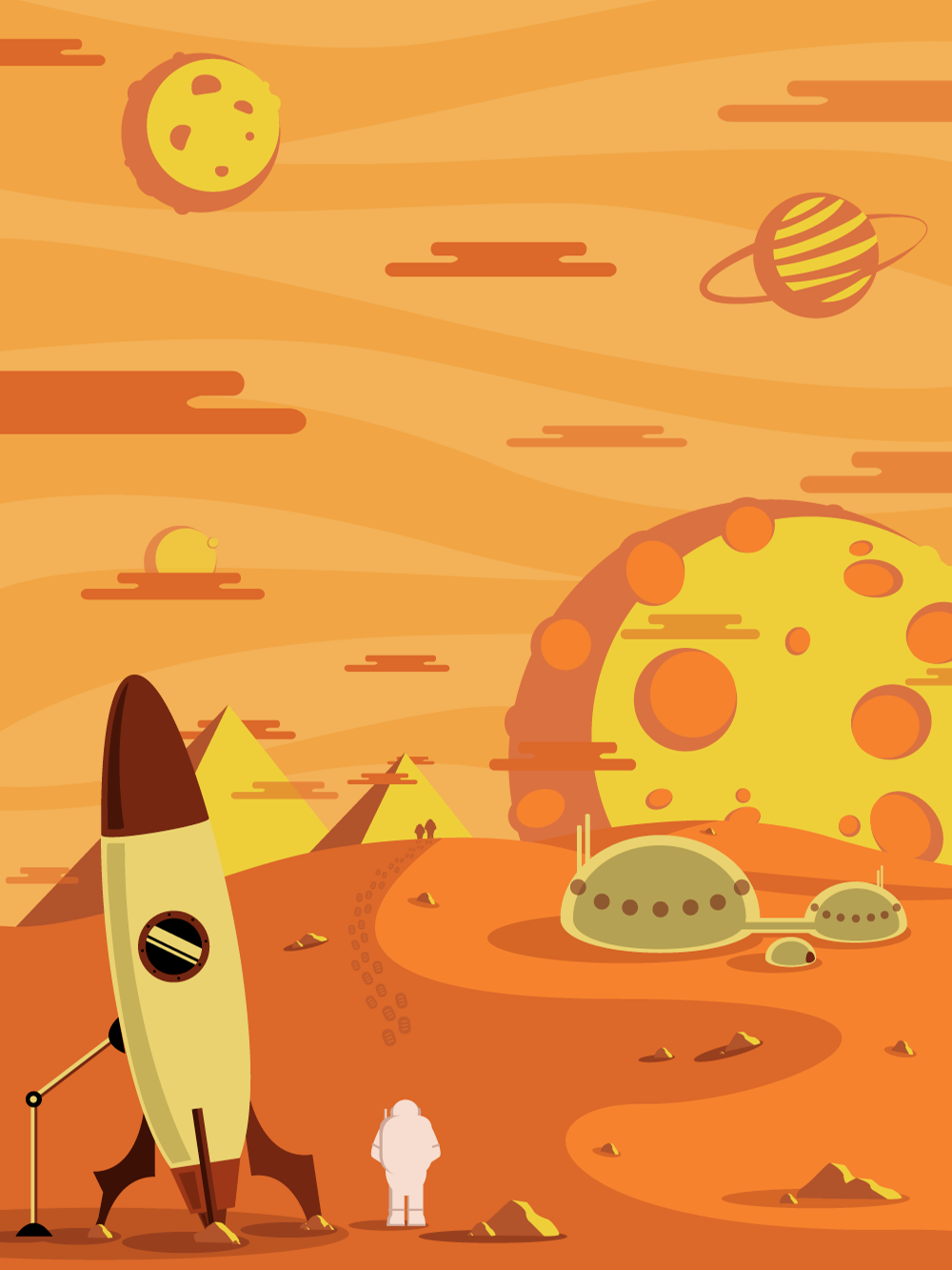
The Rabbit Hole is an illustration based on the the well known Alice In Wonderland fable. In this moment of the fable Alice falls in the hole and reappears in Wonderland. The illustration goal is to depict how both Wonderland and the reality that Alice originally lives in are parallel to each other. Imagination is an illustration of the imagination of a child created to promote creativity among the youth of the world. The illustration appears very vibrant with its choice of colors to illustrate the joy and vibrancy of a child thoughts and dreams. The first digital illustration is called A Hallow Night and the second one is called To Mars. Clean lines and the use of different shades of colors create shadows and highlights.
DIGITAL POSTERS
Digital Designs
Digital Designs
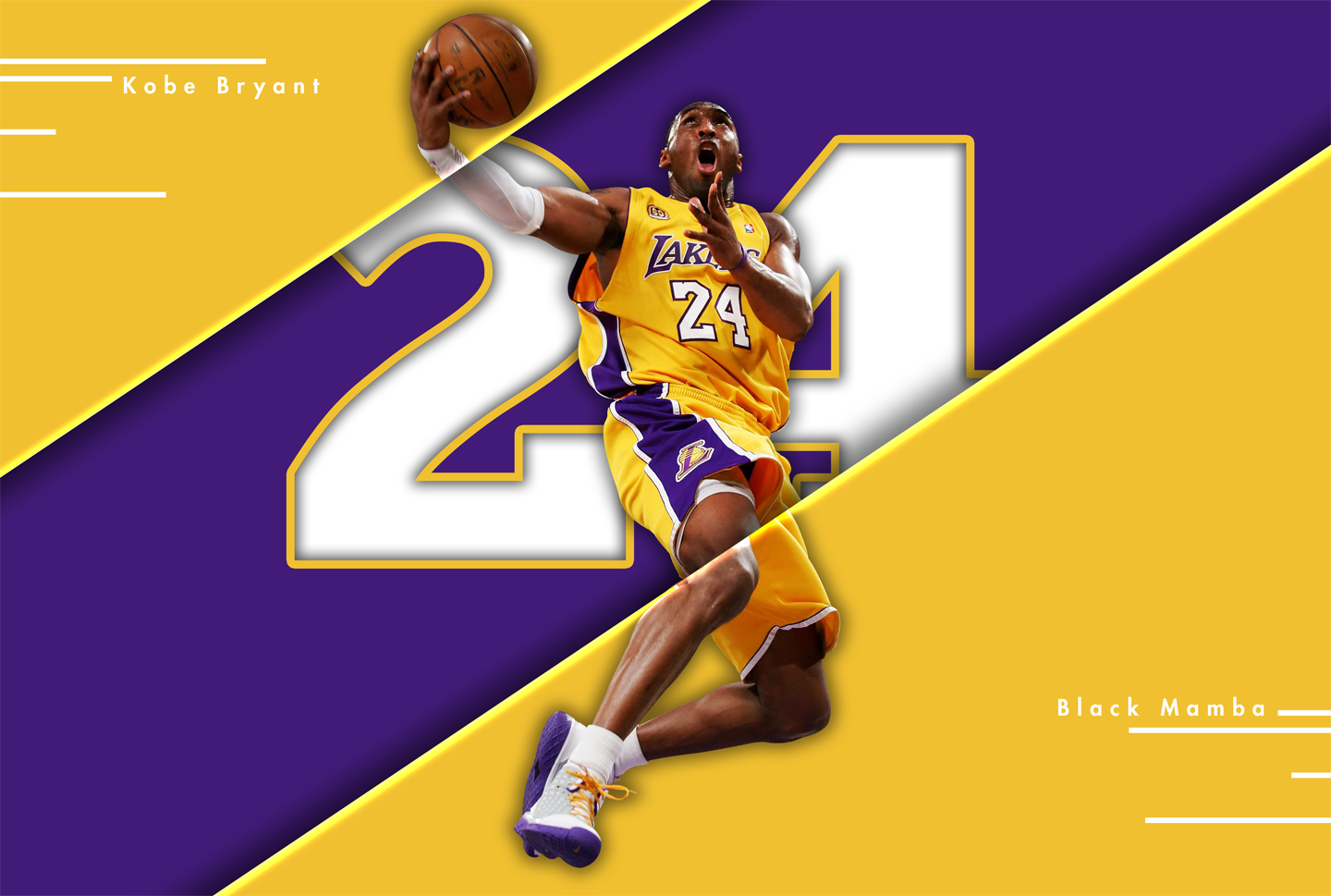
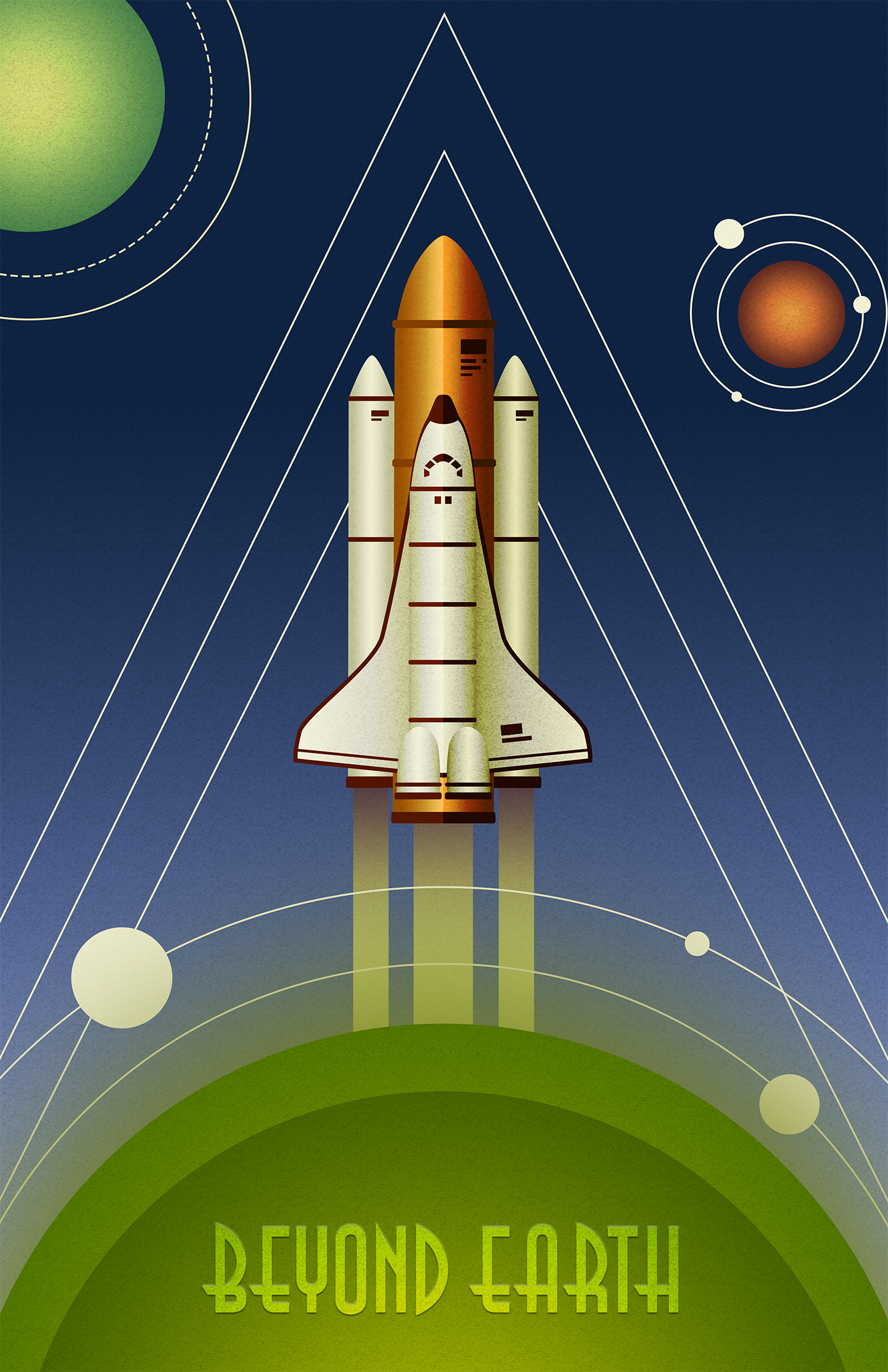
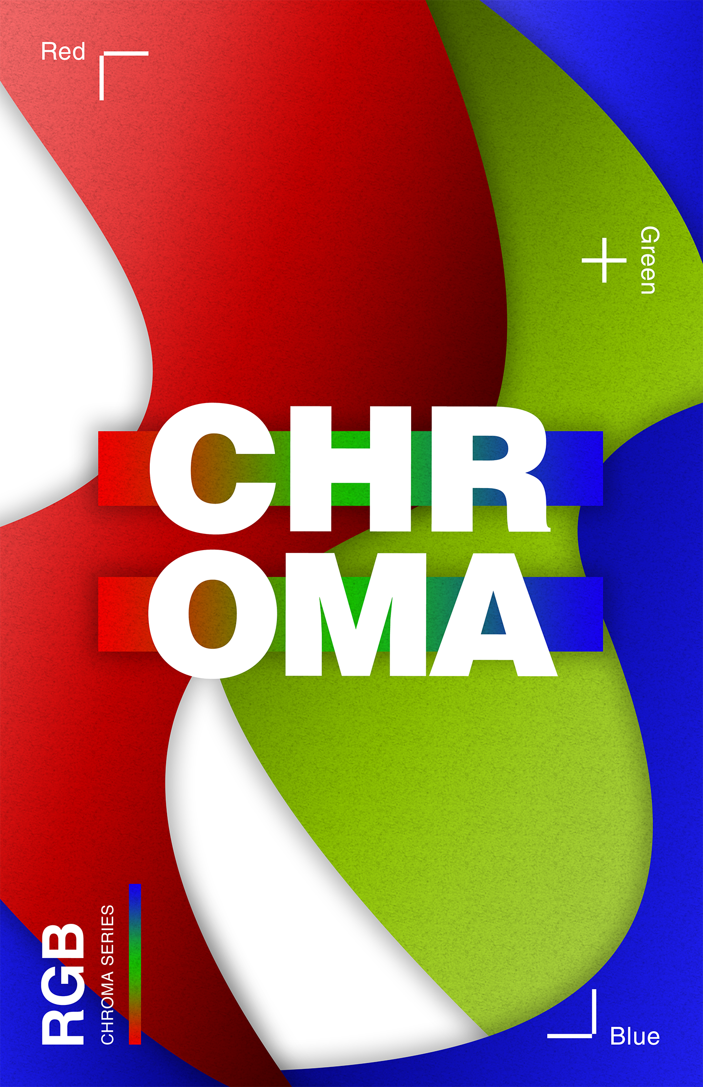
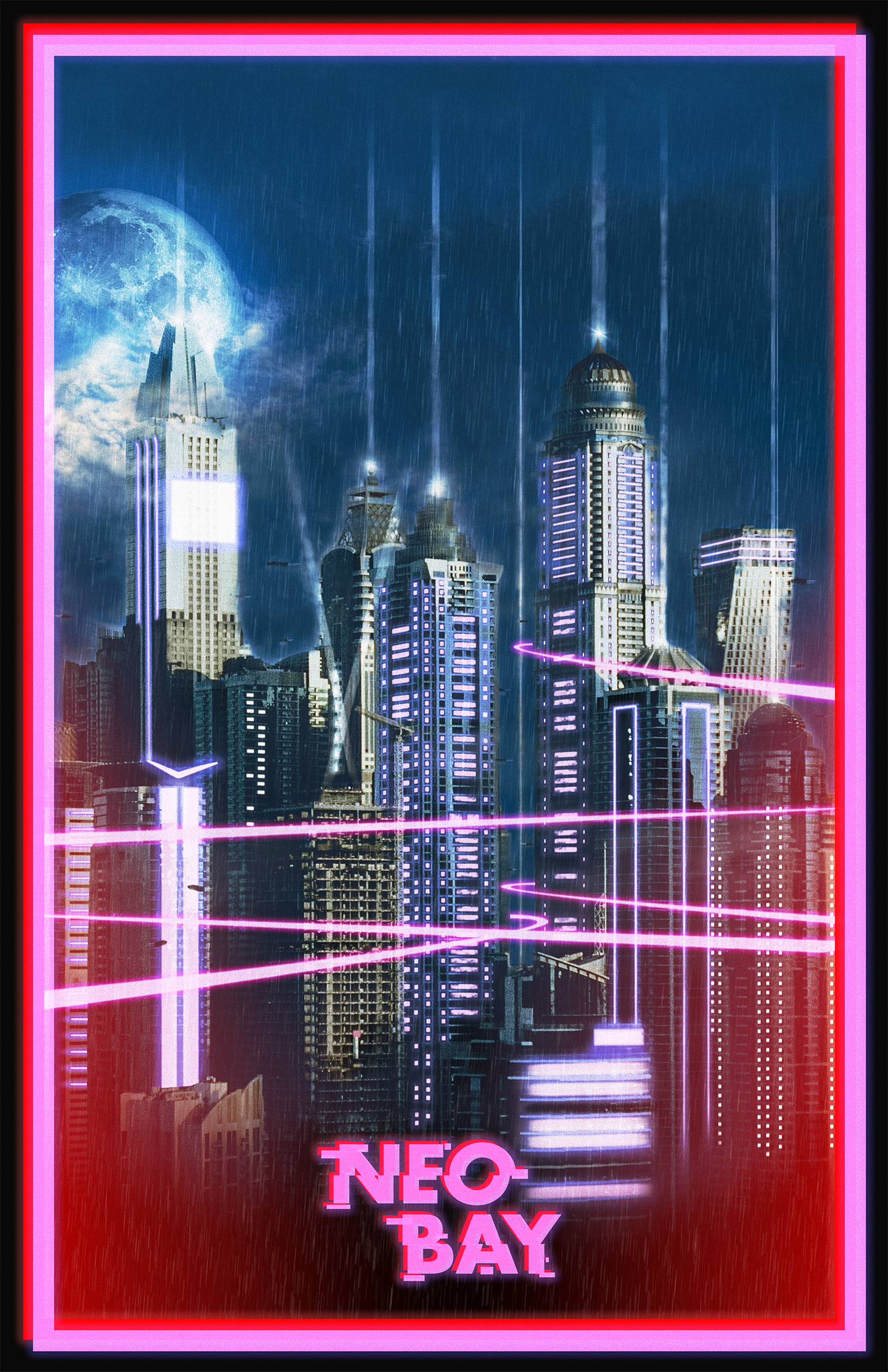
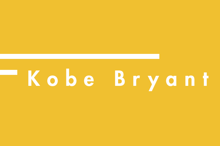
The first design breaks up the Kobe Bryant photo into sections that are not aligned on purpose. The offset image gives off a sense that the image is moving and is inspired by the movement of players in basketball. The second design is a digital poster inspired by art deco. Combining futuristic and vintage styles was the goal. Texture filter add a tactile sense to it and gradients capture the vintage look art deco. The third design is an abstract RGB color poster from the CHROMA Series. Organic shapes are combined with the same texture filter used in the previous poster design. The final design is a poster of a fictional futuristic cityscape called NEO BAY. A real life skyline photograph was used and the photo was heavily edited through Photoshop in which various filters were applied. Shapes were made with an outerglow effect to give off a neon light effect. The font for NEO BAY in the poster was also an original creation in which masking of a text and slightly changing its alignment gives off an electronic glitch effect which fits well with the futuristic theme. NEO BAY was heavily inspired by the BladeRunner movies. (Original Photograph: AFP/Getty Images)


Designed and Coded by Richard Lim